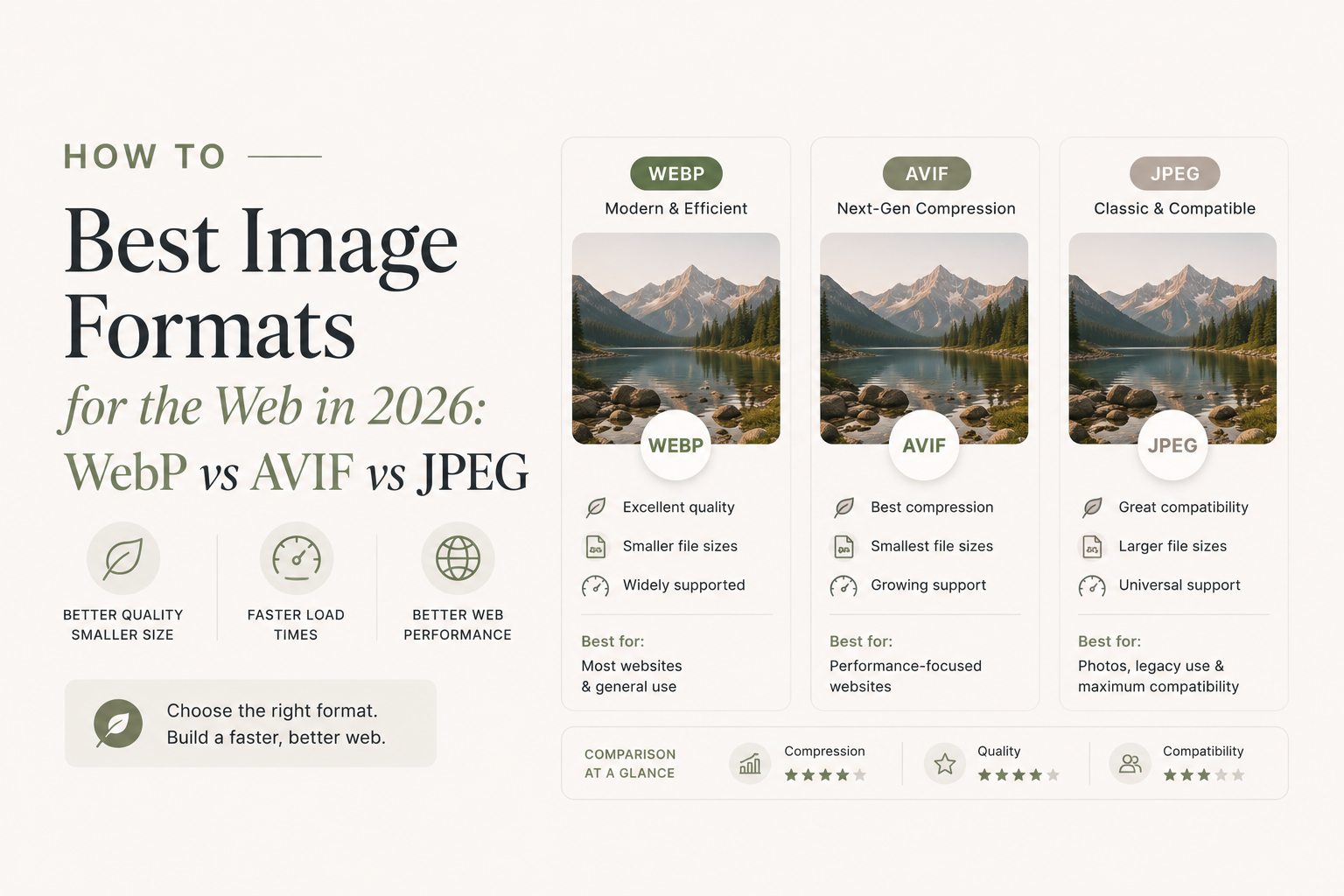
Images account for more than half of the average webpage’s total weight. Choosing the right format is one of the highest-leverage decisions you can make for your site’s performance — it directly affects load times, Core Web Vitals scores, and ultimately, how many visitors stick around.
In 2026, you have more format options than ever. But more options means more confusion. This guide cuts through the noise.
The Old Guard: JPEG and PNG
JPEG and PNG have been the bedrock of web images for decades, and they’re not going away. But understanding their strengths and weaknesses helps you know when to reach for something newer.
JPEG
JPEG uses lossy compression that discards pixel data the human eye is least likely to notice. The result: small file sizes for photographs at the cost of some fidelity, especially visible at lower quality settings (blocky artifacts, color smearing around sharp edges).
Use JPEG when:
- You need broad compatibility with legacy systems or email clients
- You’re serving photos to a very old browser segment (increasingly rare)
Avoid JPEG when:
- The image has sharp lines, text, or flat color areas — these compress poorly and artifact badly
- You need transparency
PNG
PNG uses lossless compression: every pixel is preserved exactly. That sounds great until you realise a 2400×1600 photograph saved as PNG can easily be 15 MB.
Use PNG when:
- You need pixel-perfect transparency (logos, UI assets, icons)
- You’re preserving screenshots that contain text
- The image has large areas of flat color that compress efficiently
Avoid PNG when:
- You’re serving photographs — the file sizes are enormous compared to lossy formats
WebP: The Modern Default
Google introduced WebP in 2010, but it took years to gain traction. As of 2026, WebP enjoys over 96% global browser support — essentially every browser your users are running.
WebP supports both lossy and lossless compression, plus transparency (alpha channel), making it a genuine replacement for both JPEG and PNG in most scenarios.
How much smaller is WebP?
Studies from Google and independent researchers consistently show:
- 25–34% smaller than JPEG at equivalent visual quality (lossy mode)
- 26% smaller than PNG (lossless mode)
That’s not a minor rounding — that’s a third of your image bandwidth, gone.
When to use WebP
WebP is your default choice for almost everything in 2026:
- Photographs and hero images
- Product images in e-commerce
- Blog post illustrations
- Any image that previously would have been a JPEG or PNG
The only caveat: if you need to support Safari older than version 14 (released 2020), WebP won’t render. At this point that user population is statistically negligible for most sites — check your analytics.
AVIF: The Future (Available Now)
AVIF (AV1 Image File Format) is derived from the AV1 video codec and delivers compression efficiency that makes WebP look old-fashioned. Typical results:
- 50% smaller than JPEG at equivalent quality
- 20% smaller than WebP
AVIF also handles HDR and wide color gamut better than any other web format, making it the right choice for high-quality product photography and portfolio sites where color accuracy matters.
Browser support in 2026
AVIF support has crossed ~90% globally, covering Chrome 85+, Firefox 93+, Safari 16+, and Edge 121+. The <picture> element lets you offer AVIF with a WebP fallback gracefully:
<picture>
  <source srcset="photo.avif" type="image/avif" />
  <source srcset="photo.webp" type="image/webp" />
  <img src="photo.jpg" alt="Product photo" />
</picture>
The trade-off
AVIF encoding is slower than WebP — sometimes significantly so. For static assets, this doesn’t matter: you encode once at build time. For on-the-fly image resizing, you’ll want a fast server-side encoder.
Quick Comparison
| Format | Typical savings vs JPEG | Browser support | Best for |
|---|---|---|---|
| JPEG | Baseline | ~100% | Legacy compatibility |
| PNG | Larger than JPEG | ~100% | Logos, transparency, screenshots |
| WebP | 25–34% smaller | ~96% | Everything: photos, graphics |
| AVIF | ~50% smaller | ~90% | High-quality photos, HDR images |
| SVG | Vector (infinite scale) | ~100% | Icons, logos, illustrations |
Recommendations by Use Case
Photographs and hero images
Start with AVIF, fall back to WebP, then JPEG. Use the <picture> element pattern shown above. The bandwidth savings compound dramatically across a high-traffic site.
Logos and UI icons
SVG is almost always the right answer — infinitely scalable, tiny file size, perfect rendering at any resolution. When SVG isn’t practical (e.g., a complex raster logo), use PNG for its lossless transparency.
Screenshots and UI captures
WebP in lossless mode preserves text sharpness better than JPEG while coming in significantly smaller than PNG. For screenshots containing code or small UI text, the difference in legibility between JPEG and WebP/PNG can be dramatic.
Thumbnails and previews
WebP (lossy, quality 75–85) hits the sweet spot — fast to load, good enough at small sizes, and ~96% browser support means no fallback needed.
Animated images
Replace GIFs with WebP animation or — even better — short looping <video> tags using WebM/MP4. A 2 MB GIF can often become a 200 KB video.
One More Thing: Responsive Images
Format choice pairs with responsive sizing. Serving a 3000px wide image to a 375px mobile screen — even in AVIF — wastes bandwidth. Use srcset and sizes to serve appropriately sized images at each breakpoint:
<img
  srcset="hero-400.webp 400w, hero-800.webp 800w, hero-1600.webp 1600w"
  sizes="(max-width: 640px) 100vw, (max-width: 1024px) 80vw, 1200px"
  src="hero-800.webp"
  alt="Hero image"
/>
Convert Your Images Today
Understanding formats is step one. Actually converting your existing images is where the gains are realized.
Convert your images to WebP or AVIF for free with Resizor — no upload required, everything runs in your browser.